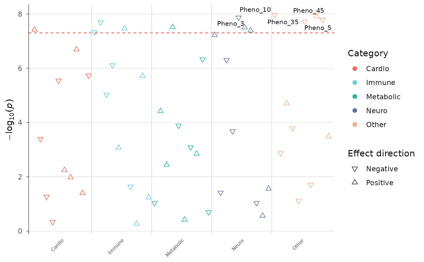
Visualize one variant tested across many phenotypes, grouped by phenotype category. The standard figure for biobank-scale phenome-wide association studies (UK Biobank, FinnGen, BioBank Japan).
Usage
phewas_plot(
  data,
  p = "p",
  phenotype = "phenotype",
  category = "category",
  beta = "beta",
  p_threshold = 5e-08,
  colors = NULL,
  point_size = 2,
  alpha = 0.8,
  label_top_n = 5,
  label_column = NULL,
  show_categories = TRUE,
  category_label_angle = 45,
  direction_shape = TRUE,
  title = NULL
)
Arguments
- data
A data.frame with columns:
phenotype,p(p-value), andcategory(phenotype group). Optional:beta,description.- p
Column name for p-values.
- phenotype
Column name for phenotype labels.
- category
Column name for phenotype categories.
- beta
Column name for effect sizes (used for direction triangles).
- p_threshold
Significance threshold line.
- colors
Named vector of colors per category, or a palette name.
- point_size
Point size.
- alpha
Point transparency.
- label_top_n
Label the top N most significant phenotypes.
- label_column
Column for label text (default: phenotype).
- show_categories
Show category labels on x-axis.
- category_label_angle
Rotation angle for category labels.
- direction_shape
If TRUE and
betais provided, use triangles pointing up (positive) or down (negative) instead of circles.- title
Plot title.